
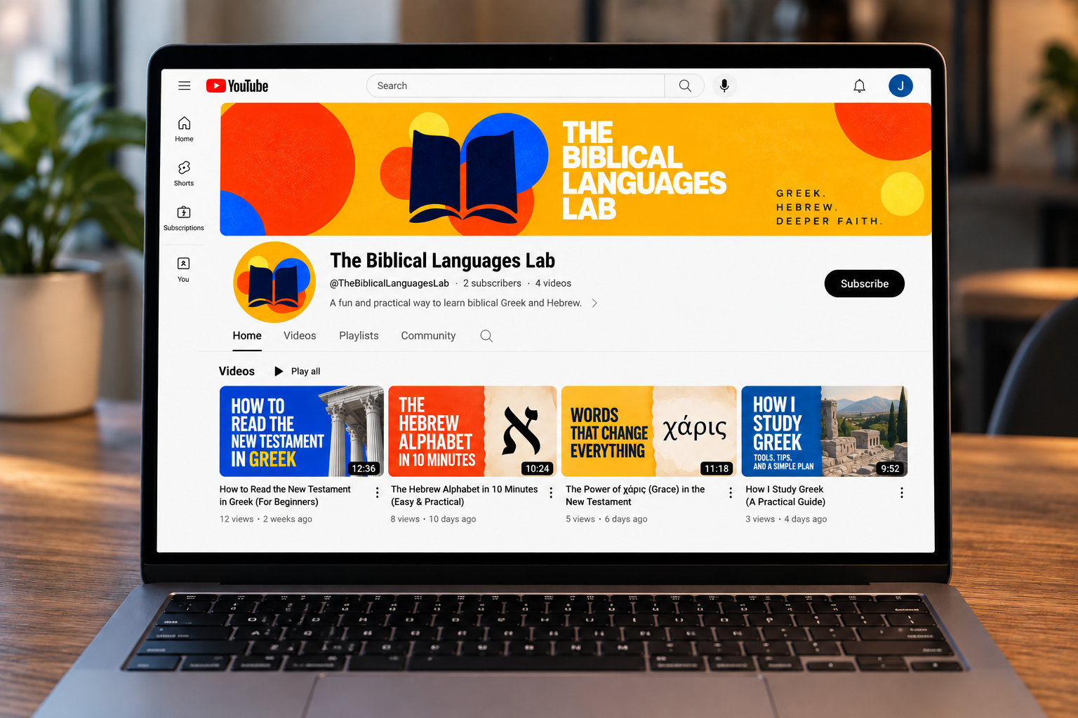
THE BIBLICAL LANGUAGES LAB
Brand Identity · Digital Strategy · YouTube · Educational Media
Making biblical Greek and Hebrew feel less intimidating—and a lot more engaging.
ROLE – Creative Direction & Design
DELIVERABLES – Identity, Channel Design, Thumbnails, Digital System
AUDIENCE – Pastors, seminary students & Bible readers
PROJECT – Personal / Independent
Ancient languages.
A fresh approach.
Biblical Greek and Hebrew are often presented as highly technical disciplines reserved for seminaries and specialists. The Biblical Languages Lab was conceived as a different kind of learning environment: accessible, visual, energetic, and academically grounded.
The challenge was to create an identity that could communicate serious engagement with the biblical text without looking like a traditional academic institution.
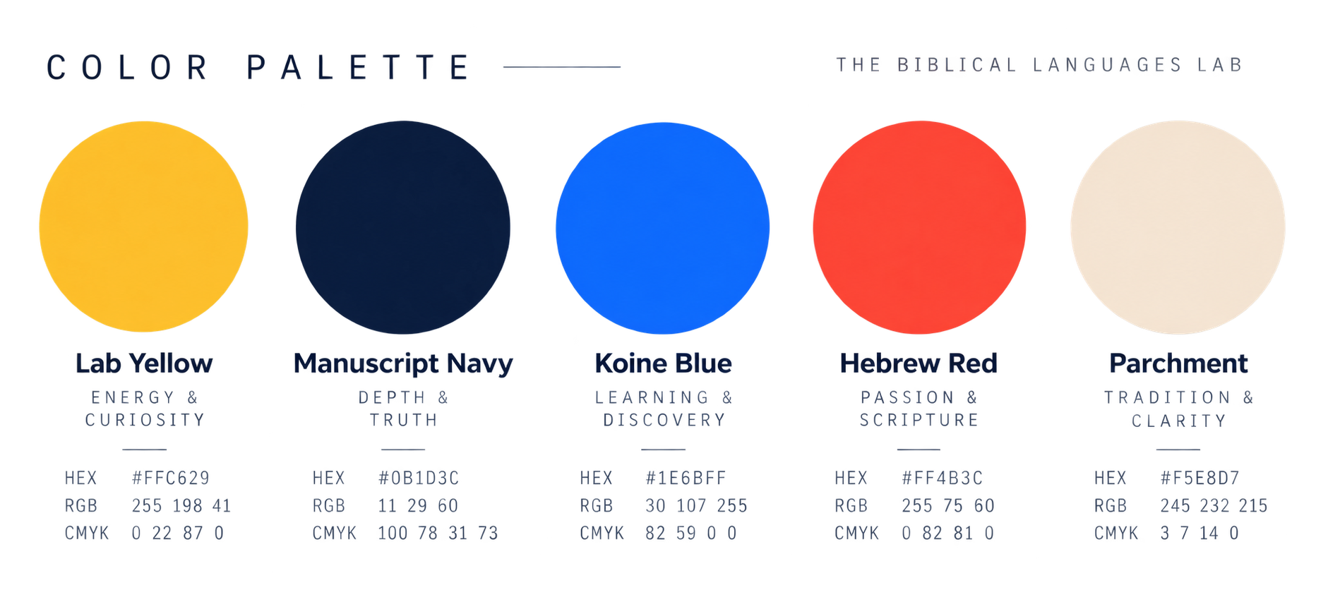
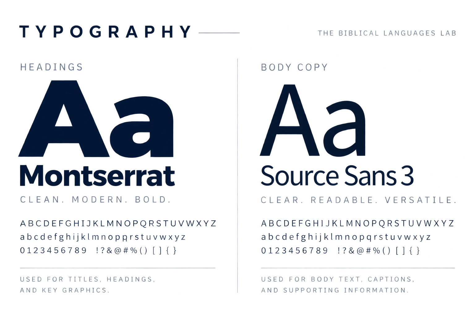
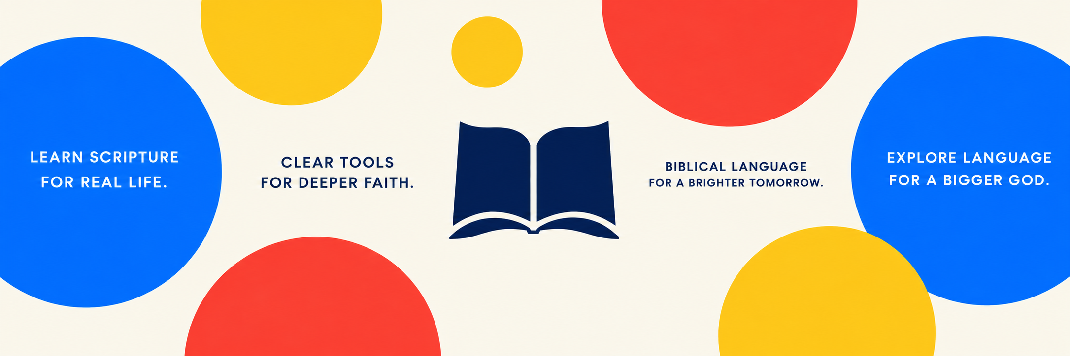
The result is a visual system built around bold color, simple geometry, approachable typography, and the central image of an open book.
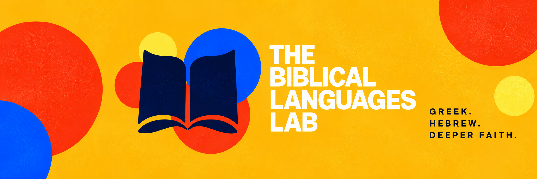
Approachable doesn't have to mean unserious.
The visual language intentionally moves away from the muted palettes and traditional typography often associated with biblical scholarship.
A flexible system for a broader story.
The identity was designed to extend beyond a single logo—across YouTube, social media, teaching graphics, and future educational resources. Each element, from the open-book mark to the color and typography, creates a visual language that is recognizable, approachable, and flexible.

Designed by someone who actually studies the languages.
The Biblical Languages Lab sits at the intersection of two areas of my work: visual communication and biblical scholarship. My graduate work in biblical languages shapes not only what the channel teaches, but how complex ideas are organized, visualized, and communicated.
Rather than treating Greek and Hebrew as decorative symbols or academic curiosities, the visual system is designed to support actual learning. The goal is to make the biblical languages feel approachable without oversimplifying them, engaging without becoming gimmicky, and academically grounded without feeling inaccessible.
That same philosophy shaped the identity itself. Bold color and simple geometric forms create an inviting point of entry, while the open-book mark keeps the focus where it belongs: on reading and understanding the biblical text more deeply.