
WIND & FIRE
A Study on Pentecost
Sermon Series · Art Direction · Visual Identity · Illustration · Environmental Design
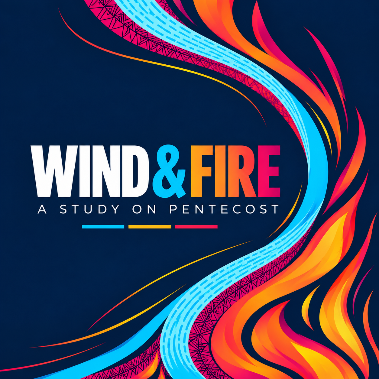
Wind & Fire is a sermon series exploring Pentecost and the Holy Spirit’s presence, power, and purpose in the life of the Church.
The visual identity brings together two of Acts 2’s most recognizable images—the rushing wind and tongues of fire—to create a system centered on movement, transformation, and mission. Bold color, expressive forms, and a clean typographic structure give the series a contemporary energy while keeping the imagery rooted in the biblical text.
SAME SPIRIT. NEW MOVEMENT.
THE CONCEPT
Ancient imagery. Contemporary movement.
The creative direction began with the visual language of Pentecost: wind and fire.
Rather than illustrating those elements literally, I developed them as flowing, interconnected forms. Cool blues sweep through the composition as wind, while orange, red, yellow, and magenta forms rise and curl as fire. Together, they create a sense that the entire composition is moving.
That movement became central to the identity. Pentecost is not presented as a static moment from the past, but as the beginning of a Spirit-empowered Church sent outward into the world.
THE DESIGN
Movement you can see.
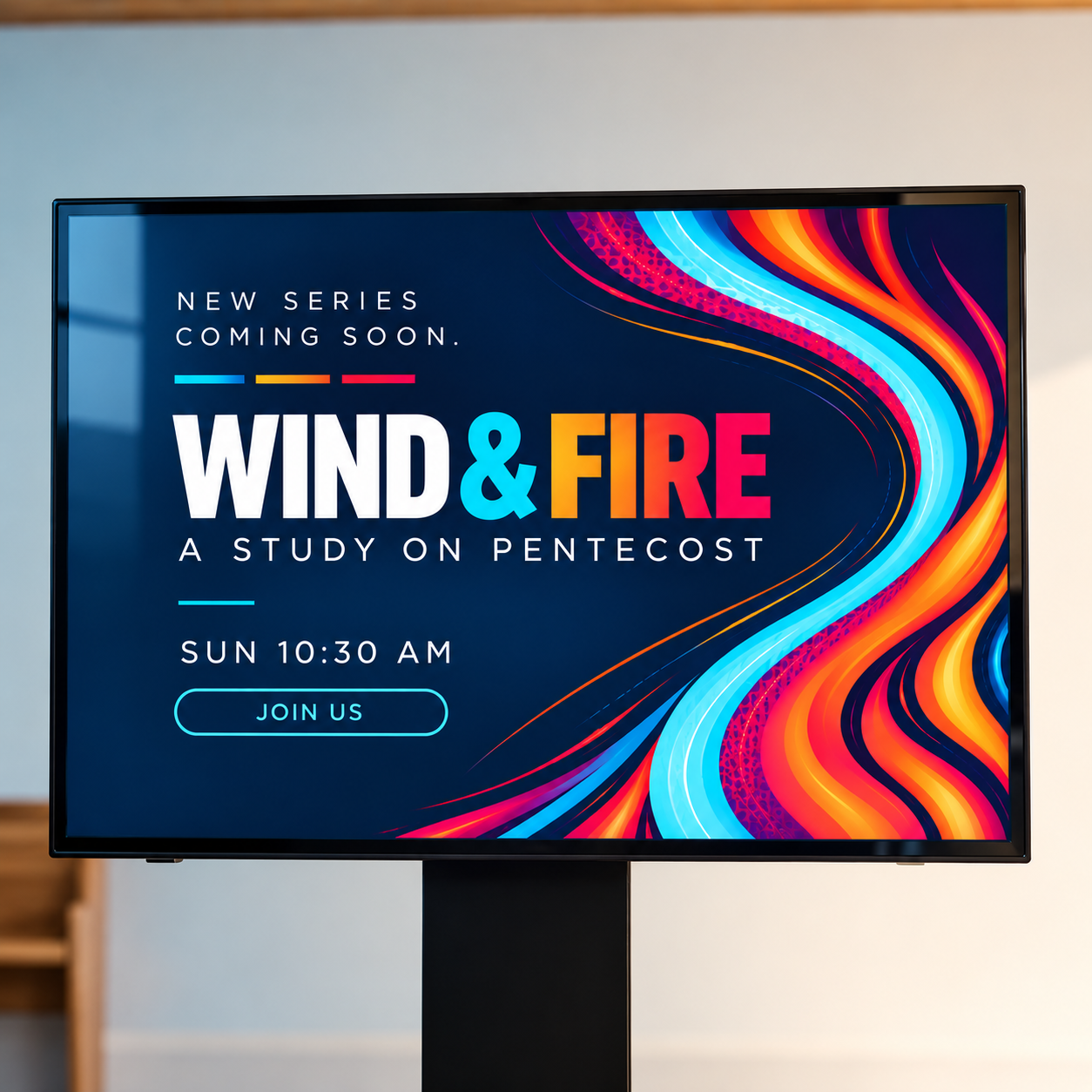
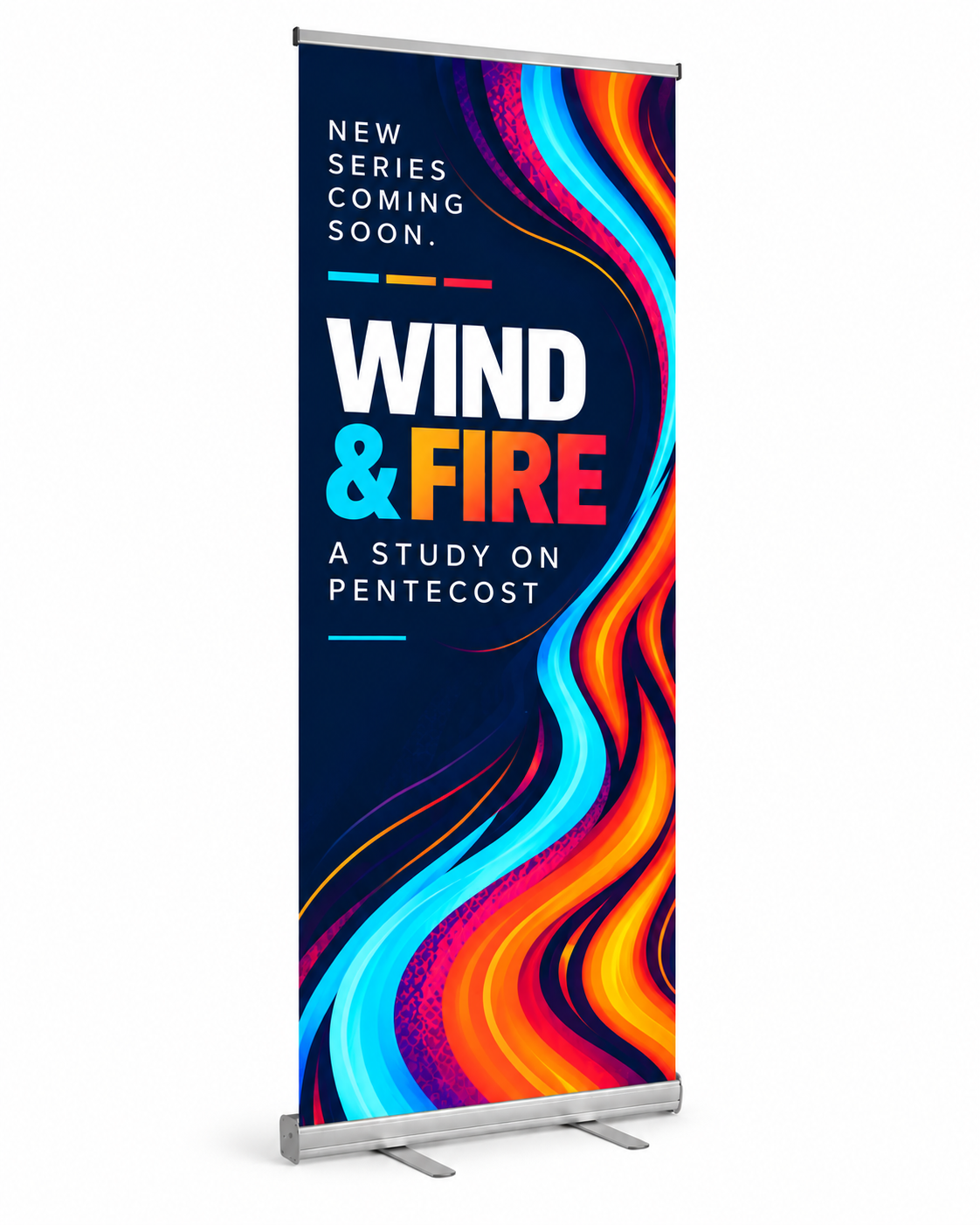
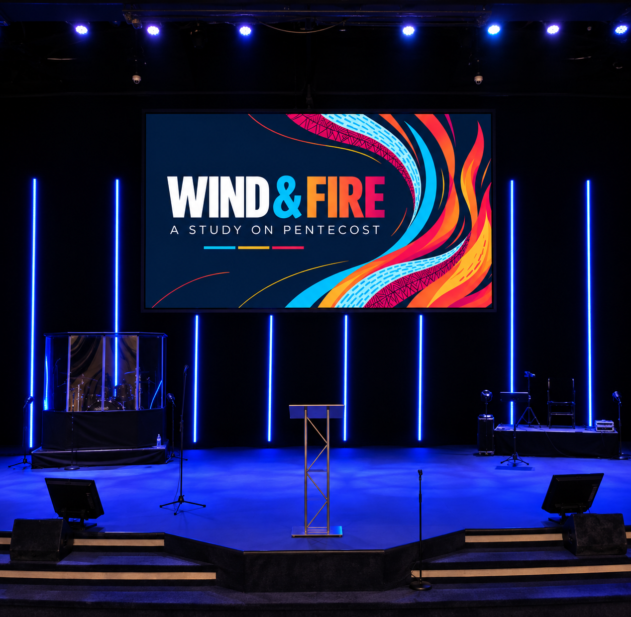
The flowing forms were designed to continually pull the eye through the composition. Wind and fire overlap, separate, and reconnect, creating rhythm without relying on a rigid pattern.
The deep navy field gives the brighter colors room to move, while the high-contrast typography establishes a strong visual anchor. Cyan, yellow, orange, and magenta provide a palette energetic enough for large screens and social media while remaining consistent across the entire series.
The result is intentionally bold: a visual identity that feels alive.
TYPOGRAPHY & COLOR
Strong enough to hold the movement.
The Wind & Fire identity pairs expressive illustration with a disciplined typographic and color system.
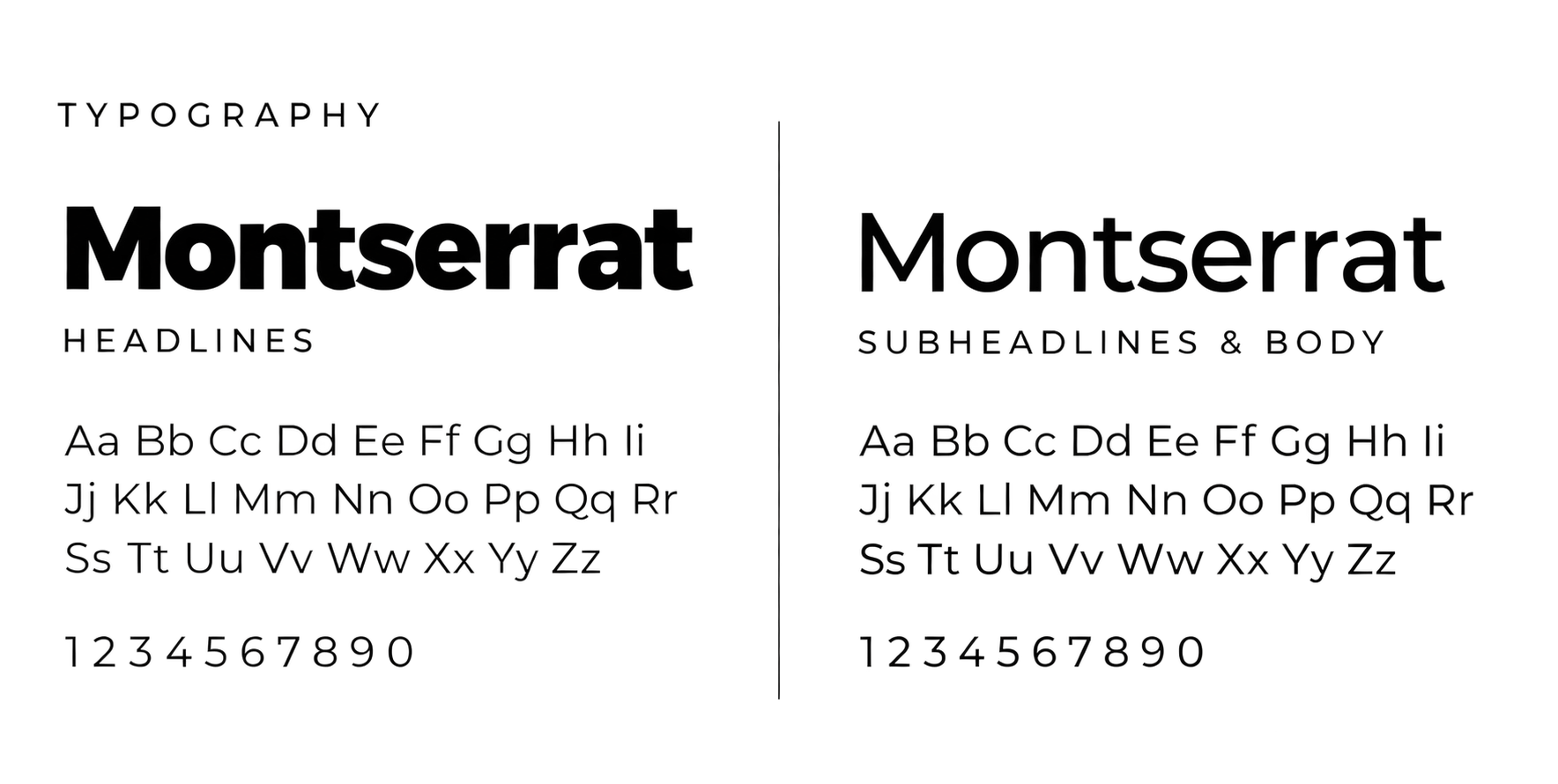
Montserrat provides the foundation throughout the series. Heavy weights give WIND & FIRE a bold visual presence, while lighter weights and expanded tracking create contrast for subtitles and supporting copy. The consistent type family keeps the system clean and structured against the movement of the illustration.
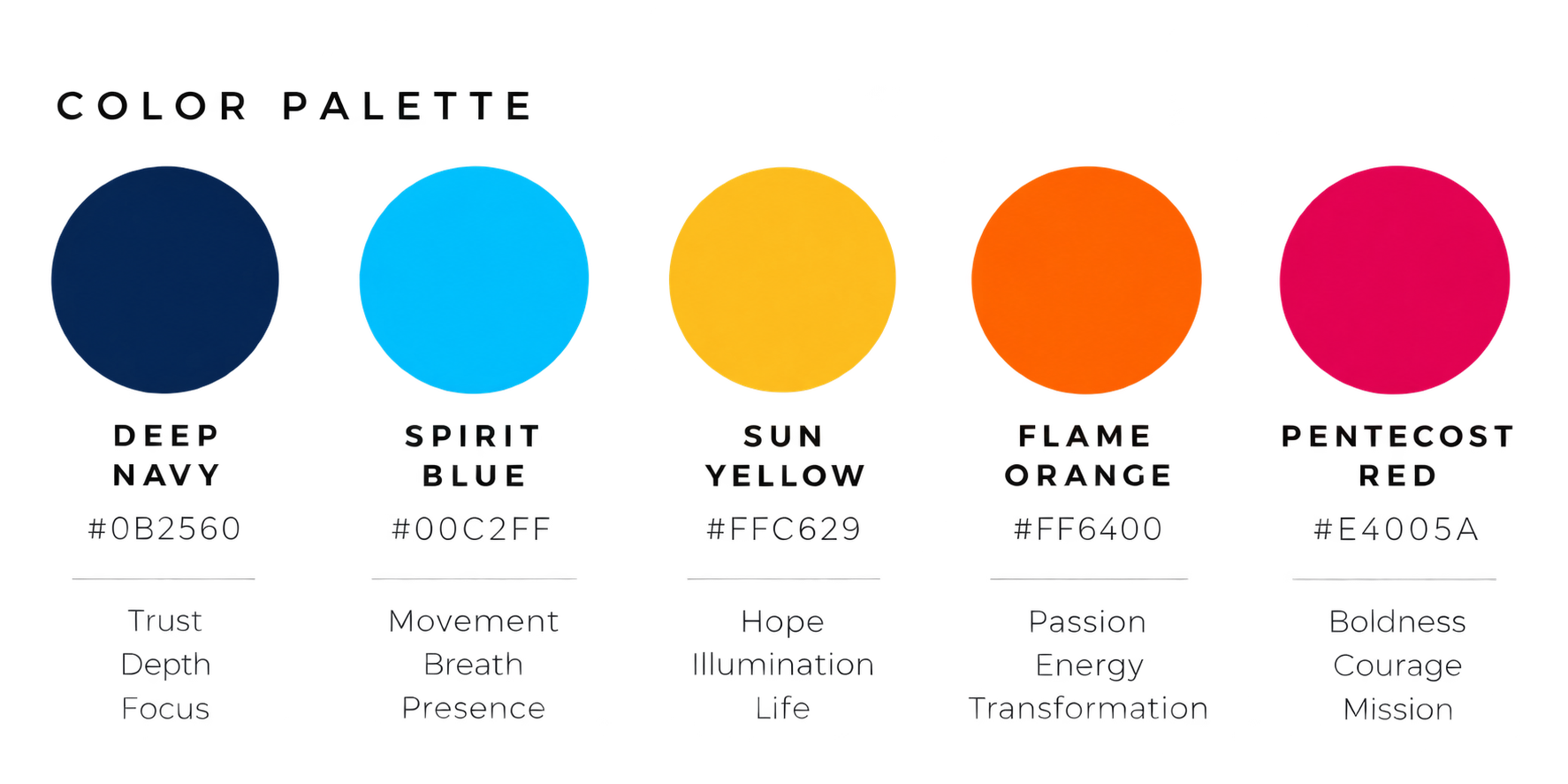
The palette draws directly from the imagery of Pentecost. Deep Navy grounds the system, Spirit Blue carries the movement of wind and breath, while Sun Yellow, Flame Orange, and Pentecost Red build warmth, energy, and intensity through the fire forms.
Together, typography and color create a visual language that feels energetic without becoming chaotic—bold enough for the room, flexible enough for the screen, and unified across every application.

And suddenly there came from heaven a sound like a mighty rushing wind, and it filled the entire house where they were sitting. And divided tongues as of fire appeared to them and rested on each one of them. And they were all filled with the Holy Spirit and began to speak in other tongues as the Spirit gave them utterance.